Test Models
Calculate accuracy metrics using new data obtained from animal surveys
2022-12-08
Source:vignettes/more/test-models.Rmd
test-models.RmdPredictive models can be used to assess animal diversity across broader areas that were not previously sampled (i.e. where animal surveys were not conducted). The accuracy of these predictions may be tested, by comparing them against results from more surveys conducted at new sampling points. This article outlines the steps required to make such comparisons, based on the calculation of accuracy metrics.
First, load the necessary packages to run the analysis:
library("biodivercity")
library("ggplot2") # for visualisation
Prepare data
Load the models for each of the animal groups:
filepath <- system.file("extdata", "models-manually-mapped.Rdata", package = "biodivercity")
load(filepath)
Load the new data from animal surveys, which will be used to check
the accuracy of the models. In this example, we focus on birds (the
taxon ‘Aves’) in the example data animal_observations and
animal_surveys. Subset the full data to our
area/period/taxon of interest, and then tally the species richness (no.
of species) of birds using the function
tally_observations():
data("animal_observations")
data("animal_surveys")

birds_new <-  tally_observations(observations = animal_observations,
                                 survey_ref = animal_surveys,
                                 specify_area = c("PG", "QT", "TP", "JW", "BS", "WL"),
                                 specify_period = c("1", "2"),
                                 specify_taxon = "Aves", # birds
                                 level = "point")  # at sampling points
To predict the number of bird species where the new animal surveys
were conducted, we also need the data for landscape predictors
summarised at these locations. The biodivercity package
includes examples at some of these sampling points, found in the dataset
points_landscape. Join these landscape data to the bird
data using the function inner_join(), then transform the
data to the appropriate format.
Note that the model object also includes the random effect
town, based on the sampling strategy used in the model’s
input data. If this random effect (column) is not provided in the new
data, predictions will be based on the ‘average’ value for the random
effect (in this example, the ‘average town’).
data(points_landscape)

birds_new <- birds_new %>%
  dplyr::inner_join(points_landscape, by = c("point_id", "area", "period"))

birds_new <- birds_new %>%
  tidyr::pivot_wider(names_from = "radius_m", # pivot to wide format (add radius info to the column names)
                     values_from = !matches("^area$") &
                       !matches("^period$") &
                       !matches("^taxon$") &
                       !matches("^point_id$") &
                       !matches("^n$") &
                       !matches("^radius_m$"),
                     names_glue = "r{radius_m}m_{.value}") %>%
  dplyr::select(where(~!all(is.na(.x)))) %>% # remove columns where all values are NA
  tidyr::drop_na() %>%  # remove any remaining NAs
  dplyr::rename(town = area) # in this example, new data also from specific towns used to fit the models (random effect)
Bootstrapping validation
Run the function validate_newdata() to obtain the
accuracy of each prediction based on the new data:
bird_xv <- validate_newdata(models = models_birds,
                            recipe_data = recipe_birds,
                            newdata = birds_new,
                            response_var = "n")
Perform bootstrapped sampling of the output bird_xv, in
order to obtain bootstrapped statistics of accuracy metrics (100
scenarios). The helper function booter() is used:
set.seed(123)

# combine animal groups as list
XV_dfs <- lapply(list(Birds = bird_xv), # only one animal group in this example
                 function(x) booter(x, n =100)) # 100 repetitions
Visualise accuracy
Finally, we can visualise the accuracy of the model for birds using
the package ggplot2. This can be done in the original scale
of the response variable (counts):
# if multiple animal groups present, combine lists into single df for plotting
XV_dfs <- XV_dfs %>%
  bind_rows(.id = "priority")


# get lower/upper bounds for confidence interval and the root mean squared error (RMSE)
XV_summaries <- XV_dfs %>%
  dplyr::group_by(priority) %>%
  dplyr::summarise(error_lwr = quantile(error_mean, 0.025, na.rm = TRUE),
                   error_upr = quantile(error_mean, 0.975, na.rm = TRUE),
                   error_normalised_lwr = quantile(error_normalised_mean, 0.025, na.rm = TRUE),
                   error_normalised_upr = quantile(error_normalised_mean, 0.975, na.rm = TRUE),
                   rmse_mean = mean(rmse, na.rm = TRUE))


# plot
XV_dfs %>%
  ggplot() +
    geom_hline(yintercept = 0, linetype = 2) +
    geom_jitter(aes(x = priority, y = error_mean),
                position = position_jitter(0.05),
                color = "gray", size = 0.1) +
   geom_errorbar(data = XV_summaries,
                 aes(x = priority, ymin = error_lwr, ymax = error_upr),
                 width = 0.1) +
   geom_text(data = XV_summaries,
             aes(x = priority, y = max(error_upr) + 2.0,
                 label = paste("RMSE =\n", round(rmse_mean, 2))),
             size = 3.5) +
    scale_y_continuous(expand = c(0, 2)) +
    xlab("Animal group") +
    ylab("Mean prediction error (no. of species)") +
    theme_bw() +
    theme(panel.grid.major.x = element_blank())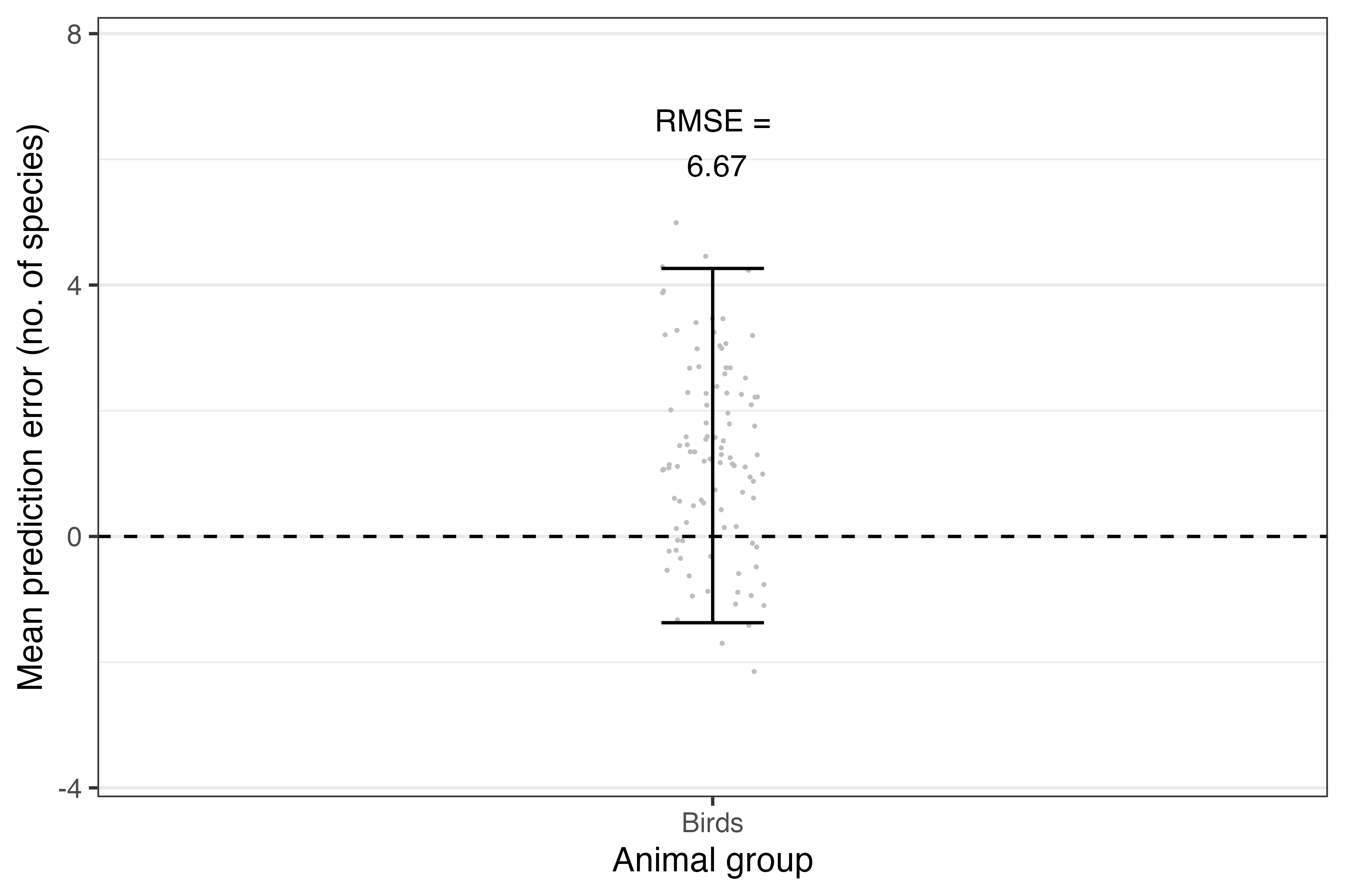
Figure: The accuracy of predictions for each taxon based on new data supplied. Grey points denote the mean errors, and the error bars denote their 95% confidence interval across 100 bootstrapped samples.
The values can also be normalised, which is especially useful when comparing between multiple animal groups (in this example, only birds are shown):
 XV_dfs %>%
  ggplot() +
    geom_hline(yintercept = 0, linetype = 2) +
    geom_jitter(aes(x = priority, y = error_normalised_mean),
                position = position_jitter(0.05),
                color = "gray", size = 0.1) +
   geom_errorbar(data = XV_summaries,
                  aes(x = priority, ymin = error_normalised_lwr, ymax = error_normalised_upr),
                 width = 0.1) +
    xlab("Animal group") +
    ylab("Mean prediction error (scaled)") +
    theme_bw() +
    theme(panel.grid.major.x = element_blank())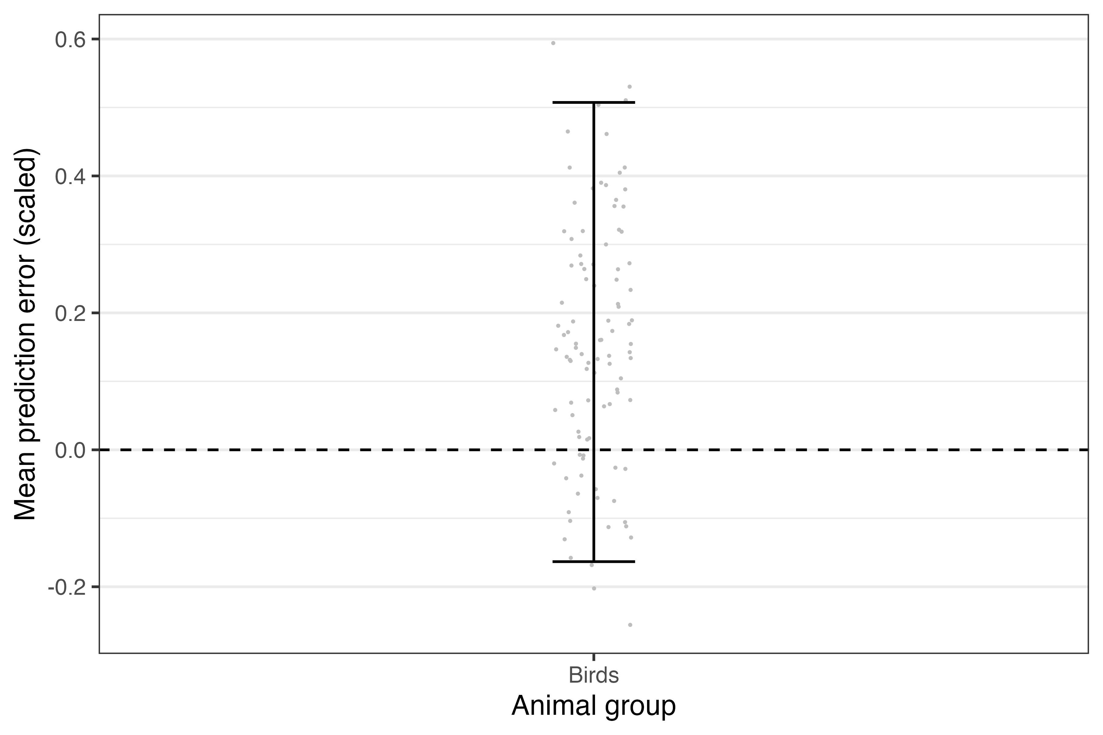
Figure: The (scaled) accuracy of predictions for each taxon based on new data supplied. Grey points denote the mean errors, and the error bars denote their 95% confidence interval across 100 bootstrapped samples.