Animals: Data Summaries
Compare local diversity between sampled areas
2022-12-08
Source:vignettes/more/animals-data-summaries.Rmd
animals-data-summaries.RmdData generated from animal surveys can be summarised at multiple levels (e.g. area, period, animal groups), in order to make direct comparisons between these groups. For example, one may be interested in differences in the number of species between different areas, or across two different time periods. This article demonstrates how such summaries may be performed and visualised.
First, load the necessary packages to run the analysis:
Summarise data
Load the example data. Refer to
help(animal_observations) and
help(animal_surveys) for more details on these datasets, as
well as vignette("process-animal") on how the animal
surveys may be processed.
Next, define the unique combinations of the grouping variables of
interest. These will be used to summarise the data. For example, animal
surveys can be summarised for each of the six towns (column
area), two survey periods (column period), as
well as four animal groups (column taxon):
## # A tibble: 40 × 3
##    area  period taxon
##    <chr>  <dbl> <chr>
##  1 BS         1 Odonata
##  2 BS         1 Lepidoptera
##  3 BS         1 Aves
##  4 BS         1 Amphibia
##  5 JW         1 Aves
##  6 JW         1 Lepidoptera
##  7 JW         1 Odonata
##  8 JW         1 Amphibia
##  9 JW         2 Aves
## 10 JW         2 Lepidoptera
## # … with 30 more rows
For each of these (rows of) unique combinations, calculate the
species accumulation curve using the function
calculate_sac(). Species accumulation curves provide useful
information on how much sampling effort is required to be reasonably
certain of the total number of species (‘gamma’ diversity) within a
given sampling unit. In this example, they allow the number of species
between different animal groups, areas and survey periods to be compared
at the same amount of sampling effort, i.e., same point along the
curves.
plot_sac <- data.frame()

for(i in 1:nrow(unique)){ # calculate for each row of 'unique'

  sac_data <- calculate_sac(observations = animal_observations,
                            survey_ref = animal_surveys,
                            specify_area = unique$area[i],
                            specify_period = unique$period[i],
                            specify_taxon = unique$taxon[i])

  # append results to plot_sac (overwrite), and order each grouping factor
  plot_sac <- plot_sac %>%
    bind_rows(sac_data) %>%
    mutate(area = factor(area, levels = c("PG", "QT", "TP", "JW", "BS", "WL"))) %>%
    mutate(taxon = factor(taxon, levels = c("Aves", "Lepidoptera", "Odonata", "Amphibia")))
}
The output plot_sac contains data points along the
species accumulation curves, i.e., the estimated number of species
(column richness) with increasing survey effort (column
sites), as well as the standard deviation (column
sd) for the estimates:
head(plot_sac)## area period taxon sites richness sd
## 1 BS 1 Odonata 1 2.533333 0.6900281
## 2 BS 1 Odonata 2 4.430508 1.1270489
## 3 BS 1 Odonata 3 5.902016 1.4111596
## 4 BS 1 Odonata 4 7.083565 1.6020460
## 5 BS 1 Odonata 5 8.063188 1.7352009
## 6 BS 1 Odonata 6 8.898539 1.8317823Make comparisons
For each animal group, we can only compare between the survey
areas/periods based on similar levels of sampling effort. Thus, we need
to extract the estimates (column richness) which have a
similar value for the column sites. To improve the
certainty of comparisons, the sampling effort used for comparisons
should be as high as possible (where the curves plateau); accordingly,
choose the highest available value for sites that are
present among all grouping variables (area, period, taxon):
n_refer <- plot_sac %>%
  group_by(area, period, taxon) %>%
  summarise(n_max = max(sites)) %>% # highest value for 'sites' across grouping vars
  group_by(area, period, taxon) %>%
  summarise(sites = min(n_max)) %>% # lowest common denominator among the grouping vars (value for 'sites' present among all)
  group_by(taxon) %>%
  summarise(sites = min(sites)) %>% # analyse each taxon separately
  inner_join(plot_sac) # join data of 'richness' for all grouping variables at corresponding value for 'sites'
The resulting dataframe n_refer allows direct
comparisons to be made between the different areas/periods, based on the
estimated number of species (column richness):
n_refer## # A tibble: 40 × 6
## taxon sites area period richness sd
## <fct> <int> <fct> <dbl> <dbl> <dbl>
## 1 Aves 84 BS 1 66 3.18
## 2 Aves 84 JW 1 61.5 4.55
## 3 Aves 84 JW 2 64.0 4.16
## 4 Aves 84 PG 1 73.8 5.27
## 5 Aves 84 PG 2 73.6 4.40
## 6 Aves 84 QT 1 82.3 3.68
## 7 Aves 84 QT 2 68.8 4.23
## 8 Aves 84 TP 1 69.9 4.19
## 9 Aves 84 TP 2 70.7 4.91
## 10 Aves 84 WL 1 64.1 4.86
## # … with 30 more rowsFinally, the species accumulation curves (plot_sac) and
comparisons based on similar sampling efforts (n_refer) can
be visualised:
plot_sac %>%

  ggplot() +
    facet_grid(taxon ~ area, scales = "free_y") +
    geom_line(aes(x = sites, y = richness, color = factor(period))) +
    geom_ribbon(aes(x = sites,
                    ymin = (richness - 2 * sd),
                    ymax = (richness + 2 * sd),
                    fill = factor(period)),
                alpha = 0.2) +
    geom_point(data = n_refer,
               aes(x = sites, y = richness), shape = 4) +
    geom_segment(data = n_refer,
                 aes(x = sites, y = 0, xend = sites, yend = richness),
                 linetype = "dashed") +
    geom_segment(data = n_refer,
                 aes(x = 0, y = richness, xend = sites, yend = richness),
                 linetype = "dashed") +
    ylab("Cumulative no. of species") +
    xlab("No. of surveys") +
    labs(color = "Survey\nPeriod", fill = "Survey\nPeriod") +
    theme_bw() +
    theme(panel.grid.major.x = element_blank(),
          panel.grid.minor.x = element_blank())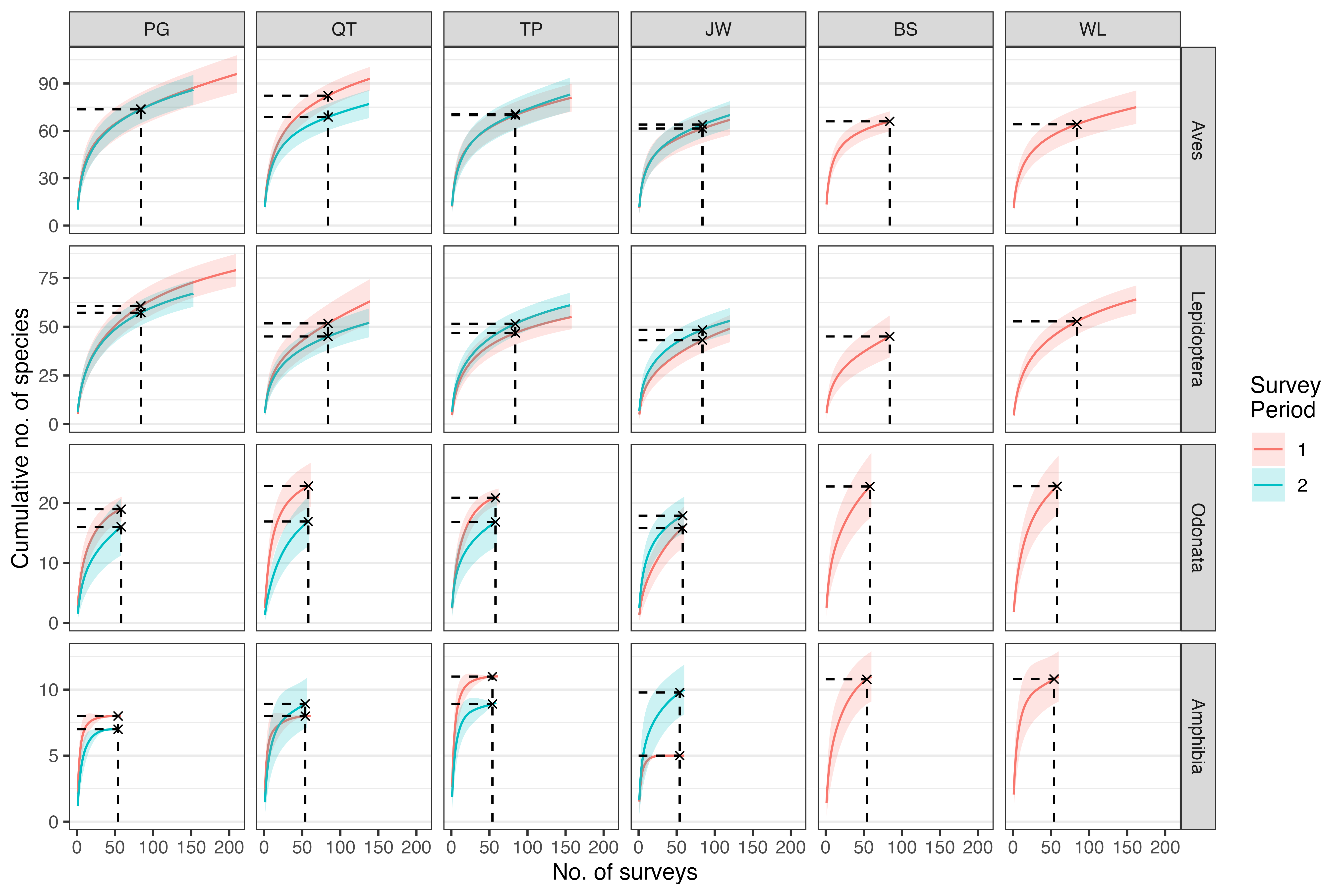
Figure: Species accumulation curves showing the number of species for each area and taxon, across two survey periods. The average number of species (solid lines) and two standard deviations of the mean (shaded region) are shown. Note that the scale of the y-axis varies between the animal groups.
Note that some of the curves have yet to reach a clear plateau,
despite the high sampling effort. At each of the six towns
(area), six surveys (cycles) were conducted
per sampling point (point_id), per survey
period (duration of one year). This was conducted for each
of the four animal groups (column taxon): Birds (Aves),
Butterflies (Lepidoptera), Odonates (Odonata) and Amphibians
(Amphibia).